In 2018 I was asked by the Brazilian Heavy Metal band RAGE IN MY EYES (formerly Scelerata) to design their logo, after their renaming and rebranding. As a long time metalhead, fan of Scelerata and good friend of the band’s drummer and founder, Francis Cassol, this project was a dream come true for me. I got started in graphic design back in 2011 with the idea of one day working with the metal scene.
The logo was designed to modernize the band’s brand without ignoring their past, very respected in the metal underground, as well as referencing their (and also mine) home state of Rio Grande do Sul, with the emphasis in the R and the S.
Logo applied to the band’s album Ice Cell, album cover art by Tiago Massetti.
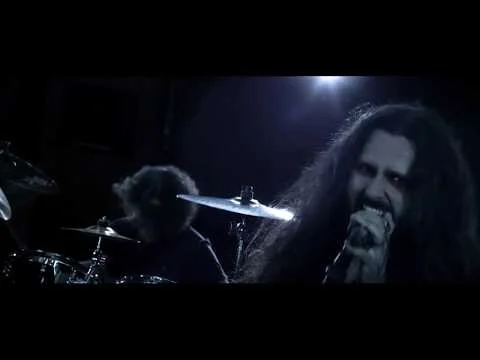
Check out the band’s music video for the song Death Sleepers!
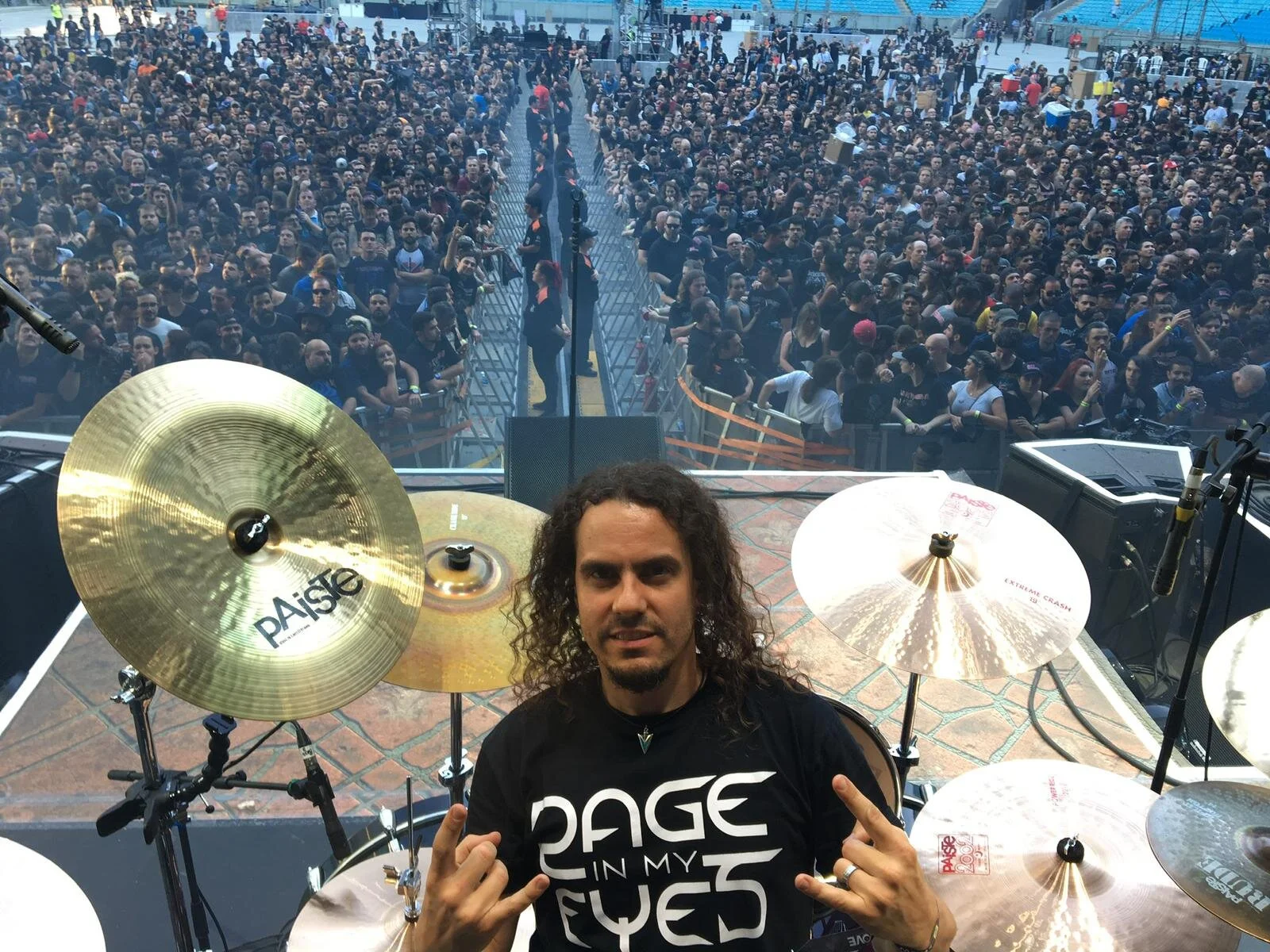
RAGE IN MY EYES’ drummer, Francis Cassol, wearing the logo t-shirt on stage.
Identity for the Grupo de Análise de Traços (Trace Analysis Group) laboratory of the Federal University of Rio Grande do Sul (UFRGS).
The lab works with chemical analysis using atomic absorption spectroscopy, hence the use of the colors from the visible spectrum. Includes a simple support pattern for use in internal slide presentations and business card.
A collection of graphic designer projects I developed professionally, either as freelance or during my work at NAPEAD.
Logo designed for Desenho Técnico (“Technical Drawing“), a series of videos for a massive open online course in engineering. This project was developed at NAPEAD.
Logo designed for my father’s law practice. The logo features the classic law imagery of the scales of justice, but also meant to resemble an angel, a reference to the catholic saint my father was named after - Saint Expeditus, patron saint of speedy causes.
Identity and art direction for Caminho da Energia (“Way of Energy”), an interactive project NAPEAD developed aimed at educating elementary school children about energy conservation and renewable energy sources. This project was the focus af an academic research paper.
Identity developed while working at NAPEAD, for Avaliação de Usabilidade (“Usability Evaluation“), a series of instructional videos about the concept of usability in design. The logo is intentionally difficult to read, inspired by an article I read about how people with dyslexia perceive text.
Jogando com o Cosmos - Projeto de Game Design para o Ensino de Atronomia ("Playing with the Cosmos - Game Design Project for the Education of Astronomy") was the name of my dissertation paper about my graduation project in Visual Design. The project was completely developed by myself with orientation by Professor Gabriela Perry of the Federal University of Rio Grande do Sul.
Carl's Saga is game design project for an educational game that aims to teach about astronomy and, more specifically, the origin of the different chemical elements in space and the components of different celestial objects. In the game, the player must collect different elements throughout space with the goal of creating a star system with a planet capable of harboring life.
Carl's Saga is a tribute to Carl Sagan (after whom the project was obviously named), Ann Druyan, Steven Sotter, Neil deGrasse Tyson, Edwin Hubble, Cecilia Payne-Gaposchkin, Annie Jump Cannon, Sir Isaac Newton, Edmond Halley, Christiaan Huygens, Johannes Kepler, Giordano Bruno and all the other great men and women who inspire us to keep looking up and who help us realize our oneness with the cosmos.
The paper can be downloaded here and the final presentation can be found here (in portuguese).
Here the player can see the elements he has already collected. Undiscovered elements are darkened.
This screen contains the elements atomic number, it's origin, where it can be found and a brief description.
Here the players can see the sectors they have been to and the percentage they have explored.
For this project I designed my own font, called Starduster. Starduster uses a 10x16 grid and simple geometric shapes. There is the complete set for upper and lower case characters for the Latin alphabet, with all the different accents. Using Starduster I created the game logo, drawing a lot of inspiration from the Star Wars and Star Trek logos and a comic book feel. For the games UI I worked with a flat style for the icons.
Featured here are some projects I made either as personal art or as school assignments.
BoJack Horseman fan art (full size here)
Photobashing/Illustration. Album cover for a fictional stoner rock band caller Acidchaser. Made in Adobe Photoshop and Adobe Illustrator. Features the font Starduster, designed by me while in college.
Digital Illustration. Based on the concept album Into the Electric Castle by the prog band Ayreon. Clip Studio Paint and Adobe Photoshop.
Vector art. Homage to the great Tom G. Warrior (Hellhammer, Celtic Frost, Tryptikon), using as basis a photo by Ester Segarra. Made in Adobe Illustrator.